LINKS
- Attack of the 50-Year-Old Comics
- Super-Team Family: The Lost Issues
- Mark Evanier's Blog
- Plaid Stallions
- Star Trek Fact Check
- The Suits of James Bond
- Wild About Harry (Houdini)
Comic book artist Murphy Anderson passed away on Oct. 23, and while I always knew I liked his work, it hadn’t occurred to me until now just how many of the most powerful and best-remembered images of my childhood flowed from his brush.
I was a “Bronze Age” kid, introduced to comics in the early 70s when Mr Anderson was teamed with the late, great Curt Swan on the Superman family of comics. Their styles melded together so seemlessly, they became known as the blended entity “Swanderson,” producing not only memorable covers and interior art but also figural icons used on the comics of the era as well as countless pieces of Superman merchandising, including a good half of my school supplies.
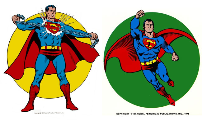
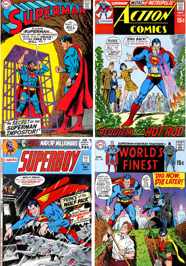
Decades later, the covers Anderson produced with (and without) Swan still have the same pull they did when they first appeared on the spinner racks, calling out to me, “Buy this book!”
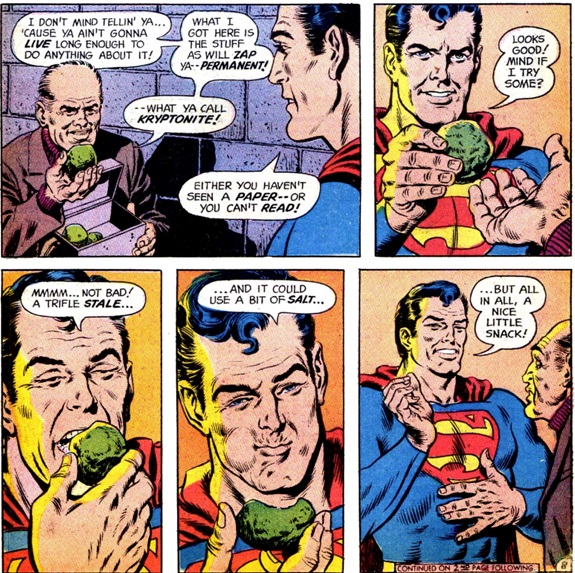
On the inside, “Swanderson” specialized in distinctive, expressive faces, something not even the best comic artists always truly master. A great example occurs in the much-celebrated and often-reprinted story, “Kryptonite Nevermore.”
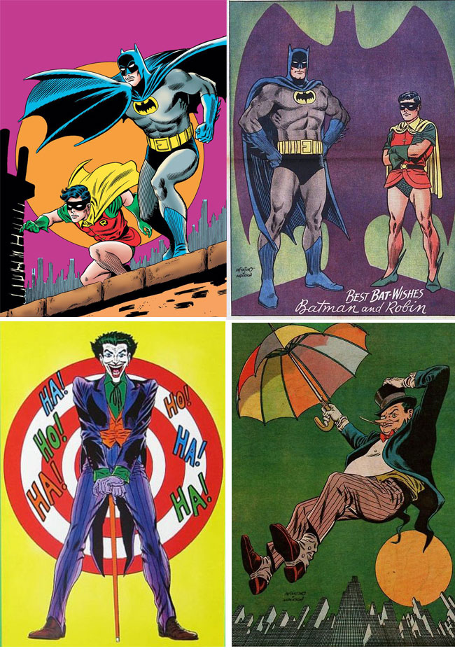
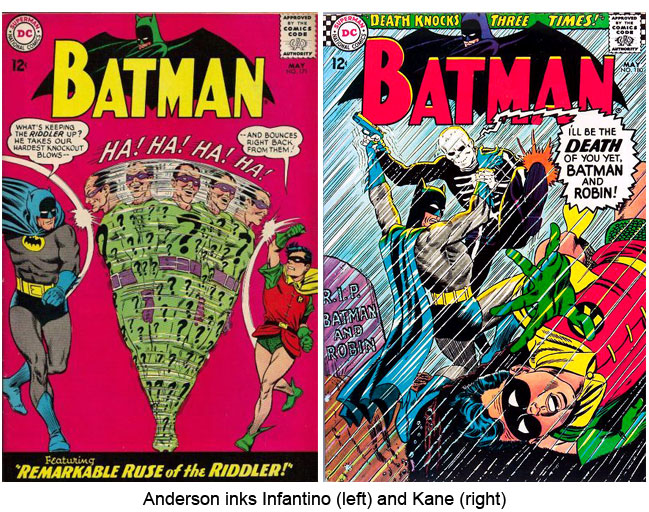
I’d missed out on the “Silver Age” of Comics by a few years, but the images Anderson created with Carmine Infantino in the ’60s for Batman and related characters were omnipresent well into the 70s. So again I knew Anderson’s work long before I figured out who he was.
One of the things that made me a “DC Kid” when most of my friends were Marvel Zombies was the more “polished,” elegant “house style” of DC art, which seemed tied to the tradition of classic magazine illustration, compared to the more hi-octane, cutting-edge Marvel style. In retrospect probably the best exemplar of “DC polish” was Anderson, who paired with Swan created Norman Rockwell-like imagery of life “not as it is but as it ought to be.” More vitally, for me, he smoothed out the rough edges of artists like Infantino and Gil Kane; each were brilliant at drawing figures that conveyed power, speed and agility, but those figures were often saddled with faces too sharp-edged and stylized (even “cartoony” at times) for my taste. If I had a criticism of Anderson, it was that when he did both pencils and inks, his figures could be a bit on the stiff, posed side, so when he was paired with Kane and Infantino, we got the best of both worlds; dynamic, kinetic figures but with added elegance and attractive faces.
This ability to, let us say, tame the wilder tendencies of some artists led to Anderson’s most controversial gig, re-drawing faces of Superman family characters in Jack Kirby’s “Fourth World” comics. Wooing Kirby away from Marvel was a coup for DC (although by the end, he couldn’t have needed much of a “push”), and for months his arrival was touted with house ads proclaiming “Kirby Is Coming!” But when he arrived, he seems to have been more than the company was ready for, so they covered up his signature style with something closer to what it was felt the DC readership would accept.
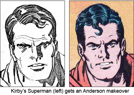
This infamous editorial move is often cited as one of the many injustices done to Kirby by various publishers, though no one blames Anderson, who just did what he was told. In all honesty, for me it worked. I likely never would have pestered my folks to buy me Kirby-era issues of “Superman’s Pal, Jimmy Olsen” without the comforting presence of Anderson’s handsome Superman. As it was, the books were already crammed with trippy psychadelic vistas and creepy creatures like “The Four-Armed Terror” that alternately intimated and thrilled grade-school me; Anderson’s reassuring inks were like having a trusted parent along on a walk through a Halloween “haunted house.”
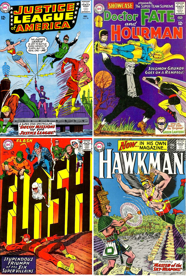
Over the years, almost every major DC character was drawn by Murphy Anderson, and they always looked the better for it.
I never got to meet Mr Anderson personally (I missed my chance at a convention once, and I’m still kicking myself for it), but he had a big impact on my youth and helped spark a lifelong love of comics. If nothing else, his consistently excellent artistic output ensures he’ll live on through his work, as long as classic old comics are reprinted.
RIP.


Yes, Swanderson!! I think you already know my opinion on this, but the art for Kryptonite Nevermore has never been equaled. I still get a thrill watching Superman tear into the fuselage of a jet with his bare hands… Anderson hit such a peak with this comic. I love his work on Silver Age Hawkman. When I think of The Atom, I think of Murphy Anderson. Your tribute says it all. Superman’s art hit a high point in the Bronze Age (70s decade), and that is the look of Superman that I relate to the most. A terrific artist.